Google is testing a new look for text and link ads for AdSense publishers.
In a post, Google said, “The new look introduces a minimalist design that brings the focus back on the text content.”
The ad ad text is left justified, the entire background is white and the button is offset to the right corner. Publishers will start seeing the new look showing on some impressions.
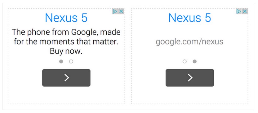
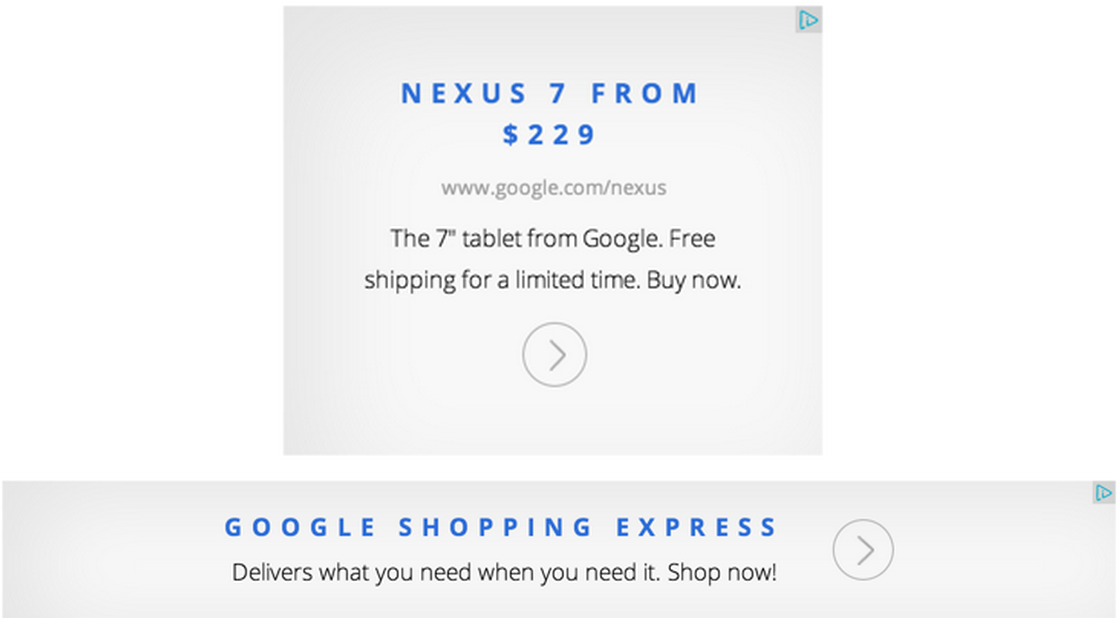
Here’s a look back at some past iterations of these ads. In December 2015 a new version removed the slider, used a san serif font and added gray shading behind the ad copy.
And here’s what the change looked like in 2014, when Google first introduced the slider on mobile text ads.
These text ads were called magazine ads when they first debuted in May 2014.


