4 International PPC Tips for Non-US English-Speaking Countries

Wu Tang is for the children; AdWords is for everyone. It’s used by marketers from Boston to Brisbane and, outside of ad extensions (some of which are unavailable in countries that don’t fly the stars and stripes) and policies grounded in legalities, the strategies SEMs use are largely the same.

Costs per click, however can vary drastically:

International AdWords average cost-per-click around the world 

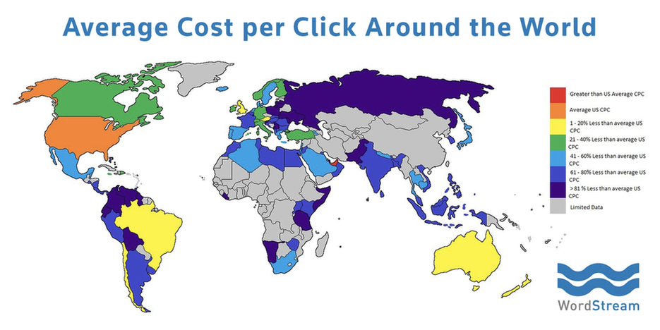
As you can see, average CPCs look drastically different depending on where you’re advertising. This disparity extends to specific verticals as well. Take a look at Keyword Planner’s different recommended bids for the term “personal injury lawyer” in four different English-speaking countries (ignoring what the average monthly search volume says about the litigiousness of each country):

USA:

 International AdWords personal injury lawyer CPC United States

Canada:

 International AdWords personal injury lawyer CPC Canada

UK:

 International AdWords personal injury lawyer CPC United Kingdom

Australia:

 International AdWords personal injury lawyer CPC Australia

There are, of course, a handful of nation-specific nuances that can impact strategy. Some are obvious, like using the regional diction and the correct currency. Others are less so, like using a local domain or knowing whether or not your target demos tend to go to work on the Queen’s birthday.

Since I’d be spewing uninformed flimflam by giving you advice on writing ad copy in or optimizing keywords in any language other than my native tongue, I’m going to focus on tips that advertisers in predominantly English-speaking countries can implement to improve their PPC performance. If you’re a neighbor to the north, down under, or across the pond, this one’s for you.

1. Build credibility with a local domain extension

Now, since you’re a savvy advertiser/business owner you’re probably already using “.au”, “.ca”, or “.co.uk.” But have you ever considered the advantage that a seemingly inconsequential domain extension gives you over competitors who roll with .com or turn their brand into an adverb (“.ly”) in an attempt to look tragically hip?

International AdWords shop local Batman slap meme 

Building trust is key for small businesses. What better way to lay the foundation for a long, fruitful customer relationship than to say “hey, I’m the guy who does that thing you want and I live right down the road” with your domain extension?

This idea is informed by SEO best practices, where, according to Search Engine Land, one can rationalize that, say, “a German speaker searching from Germany using Google.de is frequently argued to be more likely to click on a .de TLD result than otherwise.” While ultimately less impactful on CTR than, say, your ad copy, it creates instant relatability. Think of your domain extension as the ad extension you only have to worry about when it’s time to re-register.

The lesson here? ICANN offers a rambling swath of domain extensions. At best they’re kitschy. At worst, they can make your site look spammy and uncouth. Stick with the Top Level Domain you’re probably already using and keep those local customers clicking on your paid ads.

2. Know how your target demographics work, celebrate, and speak

Ask yourself one simple question: who am I trying to advertise to? Ideal customer profiles will look different for every business, but there are certain pieces of country-specific demographic information that can prove universally useful to advertisers.

When do your prospects work?

The “standard” workday in the US is 9-5, Monday through Friday. Of course, not everyone falls into this box. Areas in which startups are a dime a dozen can look completely different. Some employees roll out of bed in the early afternoon and stay ‘til the wee hours of the morning. Client-facing co-workers probably operate on a schedule that closely resembles what their parents are used to (with the occasional two-hour lunch break and 4pm quittin’ time on Thursdays).

Why does this matter? Because there are certain hours of the day during which your ideal prospects are more likely to convert. It could be while they’re at work if you’ve got a B2B offering. It could be during the commute or the evening if you’re an ecommerce outfit.

Consider the standard for your country or region and daypart accordingly.

International AdWords dayparting international PPC

What do your prospects celebrate?

What are the national holidays in your country (for your viewing pleasure: Australia, Canada, UK)?

 International AdWords international holidays Obi Wan meme

Knowing this information can give you two advantages. First, it gives you a way to plan out sale events and special offers that speak to regional customers. Since there are some holidays that just don’t translate to sales for your industry  (in the US, while Q4 is the lifeblood of many e-commerce businesses, B2B often suffers), you can also plan to shift your monthly budgets around, maximizing spend or launching tests in the days immediately before and after holidays in order to maintain a consistent run rate.

How do your prospects talk online?

As mobile usage supplants desktops across the globe, search queries—much like correspondence—are changing to mimic colloquial speech. Don’t believe me? Poke around in your search queries.

The days of the adorable old lady in a home-spun cat sweater Googling “please tell me where the nearest meadery is located” are waning. (Aside: of course, this could come back into fashion as voice search becomes more prevalent. The new Apple OS, Sierra, just added Siri to Macs: I can’t wait to watch people in Starbucks have full on conversations with laptops.) Her grandchildren are more likely to Google “meadery” (or maybe “non gmo gluten free meadery”) and expect the nearest, best one to magically float to the top of the SERP.

International AdWords grandma's first day on the internet meme 

This information, found in your search query reports, the Keyword Planner, and the related searches on the SERP, is great for everything from ad copy to keywords. Use it.

3. Money talks: make sure it’s speaking the right language

If you advertise internationally, offer customers the ability to buy your product using local currency.

Consider this. You’re based in Edinburgh. You sell engraved sterling silver flasks online to people in the UK. Thanks to some dope instas posted by a traveling tastemaker, people in Dublin, Paris, and Sydney want in on the action. To take advantage of this traffic, you’re going to want to build out some paid search campaigns.

International AdWords global currency map concept 

Don’t shoot your growth opportunity in the kneecaps: make sure these new pages show prices in the correct currencies. If people are like me, they’re inherently lazy. Make me figure out how many dollars fifty pounds is and I’ll contribute to your bounce rate real quick.

There’s a pretty easy way to do this without spending: simply duplicate your existing PPC landing pages and adjust the currencies based on the specific countries you’re targeting.

Skeptical? Understandable. But according to Shopify:

Offering the local currency can increase your sales. Quad Lock Case is a perfect example. They expanded from a one-region shop (USA/global store) to localized versions across the USA, Europe, Australia, and the UK—and they saw massive increases in purchases as a result. The increase was almost instant and has led to thousands of new orders.

4. Device usage can differ (dramatically) by country

I touched on this above, but it’s worth noting in detail: the worldwide proliferation of mobile devices is real. The extent to which smartphones have become ubiquitous varies by country, which can impact your advertising strategy. In the UK for every 100 people there are 129.6 mobile devices. In Australia, that number increases to 132. Canada, on the other hand, has a mere 79.1 per every 100 people.

If you’re located in the UK or Australia, consider the number of searchers who’ll stumble upon your ads on a smartphone and tailor your strategy accordingly. Search works different on phones than it does on desktop because there’s typically less intent to purchase.

International AdWords desktop versus mobile conversion funnels 

If you live in Canada, it makes more sense to focus efforts on desktops, since smartphones aren’t as prevalent there as they are in most other English-speaking countries. Of course, this could differ depending on your offering and target demo. Factors such as age (younger audiences favor mobile) could subvert the national norm.

If you’re not sure about your audience’s preference, segment your campaigns by device in the AdWords UI and take a look at your performance (NOTE: there’s no sense in looking into this data before optimizing your account for mobile: if you aren’t running mobile specific ads, skip this comparison, create some fresh copy specifically for smartphone users, and run the segmentation exercise in 30 days).

TL;DR

Be aware of your target audience. Establish credibility. Make their lives easier. Swandive into your newfound mounds of cash.

Continue reading

Data is Beautiful: 7 Data Visualization Tools for Digital Marketers

Did you know that, according to IBM, more than 2.5 million terabytes of data is generated every single day? To put this into perspective, one terabyte of data can contain:

  • 17,000 hours of music
  • 310,000 photos
  • More than 132,000 650-page novels
  • Almost 86 million full-page Microsoft Word documents

 Data visualization tools for digital marketers

Now multiply any one of these by 2.5 million. In the case of images, 2.5 million terabytes of data storage could contain around 775 BILLION images. To put this into perspective, there are approximately 250 billion images on Facebook – meaning that more than three times the total number of images on Facebook’s worth of data is created every single day.

It’s easy to see why so many companies struggle with Big Data.

One problem with the sheer volume of data being produced on a daily basis is that, generally speaking, enormous numbers like the ones above tend to just slide right off our collective consciousness. It’s difficult to really understand what’s going on with these figures, because we aren’t wired to handle all this information.

That’s why data visualization tools are so powerful.

In today’s post, I’ll be taking a look at seven data visualization tools that can help you make sense of the data you’re working with. Whether you need to prove results to a client or streamline your internal workflows, these data visualization tools can help you get the job done.

In the spirit of freedom of information (free as in beer), I’ve tried to include as many free, open-source data visualization tools as possible. It’s also worth noting that for the purposes of this post, we’re focusing on true data visualization tools, as opposed to programs that help users build infographics and the like.

First, let’s take a quick look at what data visualization actually is, and the types of visualizations you can create.

What Is Data Visualization?

Data visualization (often abbreviated to data viz) is the principle of taking a data set and visualizing it in a way that can be easily understood. This can something as simple as a bar chart generated from an Excel file, or as complex as an interactive multimedia experience.

 Data visualization tools concept

Newspapers such as The New York Times and the Chicago Tribune have utilized what is known as “data journalism” for years. Today, in newsrooms around the world, teams of data scientists and developers work together to create stunning visualizations of data that make the news more impactful than ever before.

One of the best examples of how powerful data visualization can be when covering a major news story is how The New York Times covered Facebook’s IPO in 2012.

Data visualization tools NYT The Facebook Offering 

The New York Times wanted to visually demonstrate the significance of Facebook’s IPO at that time, so the newspaper developed this fully interactive data visualization to drive this point home.

Readers can hover their mouse cursor over each individual company’s data visualized in the chart, which shows each company’s value at the time of their respective IPOs, plus or negative percentages for first-day changes in stock value, and the value of their stock three years after their IPO.

As the story develops, you can follow along the interactive technology IPO historical timeline. Perhaps most importantly, although this data visualization supported news coverage, it also serves as an excellent example of how a densely complex topic can be simplified and even enriched by this kind of interactive content – a valuable lesson for marketers in niche (or “boring”) verticals hoping to persuade others with their data.

A Short Note on Data Set Quality

Virtually all data visualization tools support data import via .CSV (comma-separated value) files, which are typically exported from a spreadsheet application such as Microsoft Excel or Google Sheets. However, the quality and integrity of your data play a large role in the success of your visualization, and can have a significant impact on how long a visualization will take to produce.

Data visualization tools Tableau Public CSV file import 

Connecting to a data set in Tableau Public – the point at which the quality
of your data set becomes crucially important

The “cleaner” your data is, the more effectively you’ll be able to work with it. If your .CSV file is riddled with poor formatting, missing fields, or other problems, it may be harder (or even impossible) to achieve the results you want. Newcomers to data visualization may mistake such errors for a limitation of the program they’re using, when in fact it’s an issue with the imported data.

Although data set quality and cleaning up .CSV files are beyond the scope of this post, check out this excellent tutorial from the University of California, Berkeley’s Advanced Media Institute.

Data Visualization Tool #1: Tableau

Tableau is one of the most widely used data visualization tools on the market. Available in five versions (Desktop, Server, Online, Mobile, and free-to-use Tableau Public), Tableau is among the most intuitive and user-friendly of today’s data visualization tools. For the sake of this example, we’ll be focusing on Tableau Public.

Data visualization tools Tableau Public Airbnb San Francisco  

Image via Tableau Public

What makes Tableau remarkable is the sheer diversity of tools within the application. Even the free Public version of the software offers an incredible variety of options and settings. You can create dozens of different types of visualizations, from scatter plots and heat maps to bubble maps and candlestick charts.

The image above is a screenshot of an interactive visualization created by Brit Cava, which plots Airbnb pricing and availability information across the city of San Francisco, in real time. It also shows acceptance rate data, price ranges by neighborhood, and other fascinating data.

It’s relatively easy to get started with Tableau Public but there is a learning curve. Fortunately, the official supporting documentation is awesome. Virtually every question you could think of is answered there, and there are also sample data sets available for download to help you get started.

Data Visualization Tool #2: TimelineJS

Mapping a series of events as they appear in time can be one of the most effective visual means to make connections between issues, track progress, or demonstrate patterns. TimelineJS is a powerful free tool developed by Northwestern University’s Knight Lab that helps you create engaging, timeline-based visuals to show off your data.

Data visualization tools TimelineJS 

An example TimelineJS visual, via timeline.knightlab.com

TimelineJS supports a wide range of media formats, including YouTube URLs, Google Map data, SoundCloud embeds, and Wikipedia articles. The results are amazing, and every element on-screen is interactive, meaning users can scroll along the timeline at their own pace, or click on specific media elements, such as a YouTube video or SoundCloud audio file. The example timeline above chronicles the milestone accomplishments of women in the field of computer science, a fascinating interactive journey with a wide range of supporting media. 

Overall, TimelineJS is an awesome tool. Perhaps best of all for beginners is that you don’t need to know how to code in order to create beautiful timelines.

Data Visualization Tool #3: Google Charts

Google Charts is an entire set of data visualization tools that supports a wide range of data formats and visual output.

 Data visualization tools Google Charts screenshot

Google Charts works excellently with geolocation data, but you can also output your data in a wide range of formats, including histograms, sankey diagrams, trendlines, and waterfall charts.

As powerful as Google Charts can be, it’s not for the complete initiate. There’s some coding involved to get the most out of the tools, but the supporting documentation is very comprehensive. That said, I’d recommend Google Charts to those of you who’ve worked with data before, have a working knowledge of JavaScript, and are looking for a robust set of tools.

Data Visualization Tool #4: Plotly

Remember earlier when we talked about data journalism? About how some of the most sophisticated data visualizations were, in fact, developed by maybe dozens of people? This is one of the biggest barriers to effective, collaborative data visualization work. Plotly aims to change that.

 Data visualization tools Plotly screenshot

The interface of Plotly’s free web-based chart tool

Plotly is a web-based data visualization platform that allows users to create everything from simple charts to complex graphs directly in their web browser. The interface of the free tool (as seen above) is clean, intuitive, and surprisingly fully featured for a free web application. It’s worth noting that some chart types, such as box plots, histograms, and satellite maps are only available to subscribers.

Data Visualization Tool #5: RAW

RAW describes itself as, “The missing link between spreadsheets and vector graphics.”

Available completely free under LGPL license, RAW is an open web app built with the D3.js JavaScript library, and was developed by Italian research lab DensityDesign. It allows users to create stylish data visualizations quickly and easily, with no coding or technical expertise necessary.

To start using RAW, simply copy/paste the relevant data directly from your spreadsheet program into RAW, choose a data visualization type, and set your parameters using a drag-and-drop interface. Each individual parameter or visual metric can be adjusted, and the interface is clean and intuitive, making it ideal for beginners.

Data Visualization Tool #6: Charted

Another data visualization tool that makes creating beautiful visuals effortless is Charted. Developed by the folks at the Product Science team at Medium, Charted couldn’t be easier to use. Either enter the URL of an online spreadsheet or upload your .CSV data manually and Charted will do everything else.

 Data visualization tools Charted screenshot

Although Charted is certainly visually minimal, don’t mistake its simple elegance for limited functionality. Charted is a robust tool that can handle plenty of data, so don’t be afraid to push the boundaries. It is, however, definitely one of the most accessible, lightweight data visualization tools out there.

Charted is quick, easy, beautiful, and perhaps best of all, completely free and open-source under the MIT license. Give it a shot if you need results fast.

Data Visualization Tool #7: Leaflet

Although some of the tools we’ve looked at have excellent built-in support for the creation of interactive map visualizations, we haven’t examined any of the dozens of map-building data viz tools available out there. Leaflet, developed by Vladimir Agafonkin, is one of the best.

Data visualization tools Leaflet map screenshot

An interactive chloropleth map of population density across the U.S., built in Leaflet using a
publicly available data set from the U.S. Census Bureau and GeoJSON data

Leaflet is a very lightweight JavaScript library (just 33 kilobytes!) that helps users build beautiful, elegant interactive maps. Leaflet boasts a wide range of features, such as tile and vector layer support, image overlays and GeoJSON data integration, pure CSS3 popups and controls for effortless visual customization, smart polygonal rendering, and even built-in hardware acceleration for Leaflet on mobile devices.

As an open-source project, the source code is freely available on GitHub for anyone to fork and improve upon, and Leaflet works on all major desktop and mobile operating systems and browsers. The API documentation is lovingly well-maintained by the project developers, and there are plenty of third-party plugins that offer even more functionality.

 Data visualization tools Leaflet screenshot

A star map generated in Leaflet using data from open-source video game Star Control 2,
generated using coordinate reference system (CRS) data

It’s worth noting that although Leaflet’s tutorials and supporting documentation are excellent, you will need a working knowledge of JavaScript libraries to work with the program. That said, it’s an easy library to work with (no external dependencies needed) and the Leaflet community is awesome.

If you need to build a lightweight interactive map as part of your next visualization, you owe it to yourself to try Leaflet.

In Data We Trust

Marketers rely on data to make crucial decisions about their campaigns, secure buy-in from stakeholders, and to track the progress – and effectiveness – of projects over time. By using data visualization tools, you can bring your data to life, making it more persuasive, more compelling, and more engaging.

Whether you’re a content marketer or a PPC specialist, hopefully you’ll find some interesting ways to use the tools above. 

Continue reading

MarTech Today: Bombora’s self-service for surge intent data, Google Penguin’s update & Apple’s Echo-like Siri assistant

Here’s our recap of what happened in marketing technology, as reported on Marketing Land and other places across the web. From Marketing Land: Bombora gives marketers self-service access to its B2B surge intent data Sep 23, 2016 by Barry Levine Instead of 24-hour-turnarounds for individual…

Please visit Marketing Land for the full article.

Continue reading