When it comes to landing pages, we’ve covered which headline formulas work best and what CTA features motivate the most people.
But the images you use on your landing pages are the next critical component to nailing down landing page best practices.
Why?
Landing page images have been shown by numerous studies over the past few years to either enhance readers’ experience on the page, or distractthem from the task at hand.
That means they can increase your conversion rates to improve results exponentially, or potentially cause serious damage.
Here’s a quick rundown, backed by data, of what elements the best-performing landing page images incldue.
What should be in your landing page images? (Hint: People)
When in doubt, use a human’s face.
Research studies have shown, timeandtimeagain, that images of human faces can increase the trust and overall first impression a visitor has on a site.
Visual Website Optimizer proved this with a simple A/B test to see the difference in conversions. MedaliaArt (obviously an art store) ran a simple A/B test to compare the “engagement results” (defined as a click – or not a bounce) between an image featuring an artist’s actual paintings vs. those with an image of the artist.
First, the control:
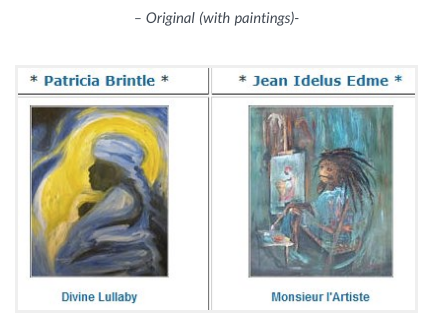
And the new variation featuring human faces:

The results showed a 95% conversion rate increase (statistically significant) when using the artists’ photos – in other words, almost twice as many people clicked through to view more.
It was simple, and effective.
However…not just any photos of humans will do. For example, there’s a BIG difference between generic, stock looking photos and more realistic ones.
Here’s why.
…But not stock images or irrelevant people
86% of your consumers are banner blind today. The other ~14%?
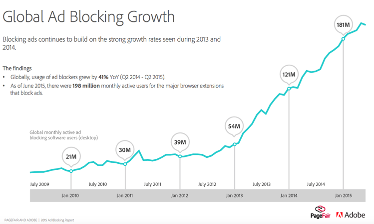
They probably have ad blocking software enabled, as their use has quadrupled over the past few years according to the MIT Technology Review.
Even worse, many image-based display ads only post a ~1% average click through rate.
The lesson? Consumers have been conditioned to completely ignore anything that resembles an ad on websites.
That’s an issue for your landing pages, which commonly run into the same problems.
For example, the Nielson Norman Group has conducted eye tracking studies to determine which types of images work best. And they found out that there are big differences in how photos of real people are viewed. Some are “treated as content” and “scrutinized” longer. While others that tend to be “decorative” are completely ignored.
On the plus side, they saw a 10% greater viewing time on Freshbooks’ team page photos (as opposed to the bio information).
On the flip side, the Nielson Norman Group found one image on the Yale School of Management page was completely ignored.
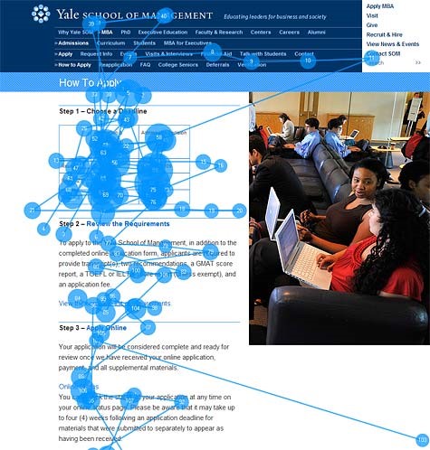
These results were somewhat surprising, as the image above actually does feature real people. However the result, and the somewhat irrelevant use of the image on this page, leave it feeling a little too stock-ish.
According to their findings, anything that looks too “jazzed-up” or advertisement-like will be ignored on the web.
As for product images? Go for detail and interactivity
Obviously you can’t always use photos of humans though.
What if you’re a product company, and you need to actually show photos of, you know, products?!
The same Nielson Normon Group eye tracking study looked at e-commerce category pages from two different websites, Pottery Barn and Amazon, to see how product photos influenced viewer’s actions.
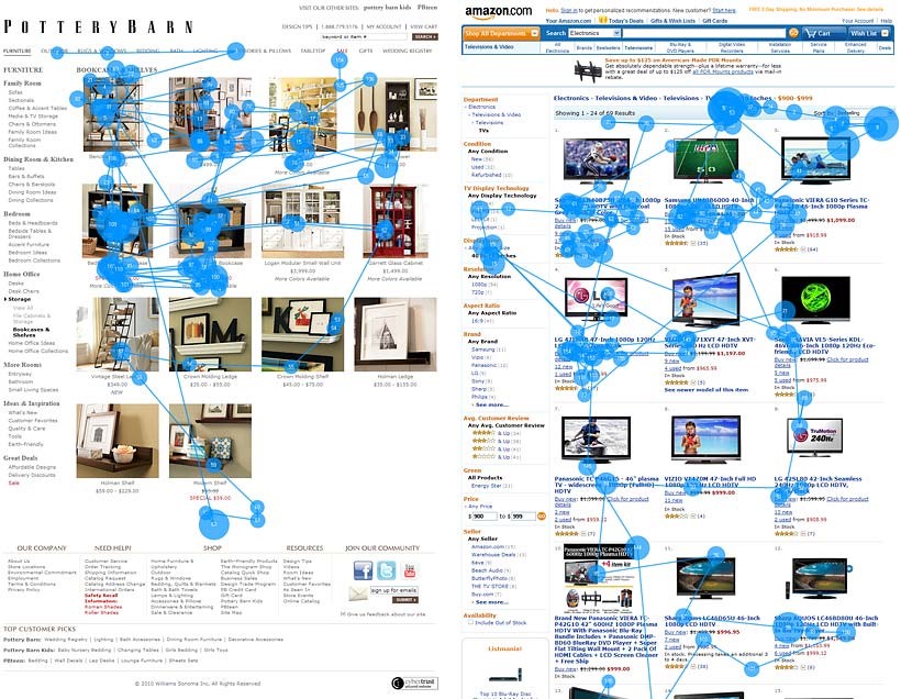
Interestingly, Pottery Barn’s photos on the left were “studied intensely” and received much more attention because the bookcase images were highly detailed, showcasing the differences between individual products.
In comparison the Amazon TV ones on the right were barely look at compared with the text (where the overwhelming majority of 82% viewing time was spent).
This discrepancy between the two examples was brilliantly summarized:
This is a good example of why it’s not always good to copy the biggest sites’ designs. Because Amazon hawks a monstrously wide product range, they use a standardized gallery layout that sort of works for many different category pages, without being optimized for any individual category. In contrast, Pottery Barn is optimized for its narrower range of products, so its category pages have more detailed photos.
The first takeaway is that detailed product images (highlighting differences, features and use cases) beat generic ones with filler-like examples.
The second is that more interactive ones can increase results further.
For example, adding multiple viewing angles and spinning or 360° rotating images have helped boost conversions across the board.
Adding one of these spinny-product-thingy’s to DueMaternity.com resulted in a 27% conversion lift, while also benefiting Golfsmith.com 10% on the low end and 30-40% on the high end.
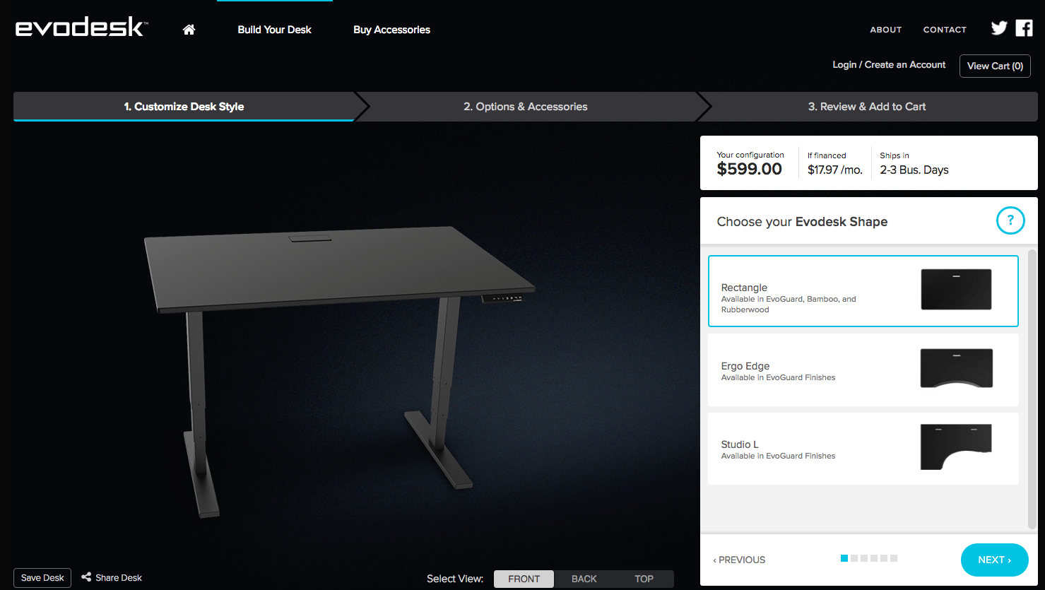
One of my personal favorite examples is EvoDesk, whose personal desk builder strikes me with a severe case of desk envy every time I visit their site.
Use landing page images to direct the viewer’s attention
The only people who read online are the marketing geeks reading this very blog post. Everyone else scans. (And multitasks.)
Images are a mental shortcut to help communicate everything a page says faster and better than any 2,000 words can (despite Google’s preference for the latter).
When used properly, images can help you capitalize on this pervasive scanning and multitasking behavior by providing a subtle nod or nudge in the direction you want people to go. For example, by directing people’s attention over to a Quote Request form or a Buy Now button.
A recent study by ConversionXL has helped us determine which forms of visual cues work best.
When in doubt, go with a person… right?
Not always:
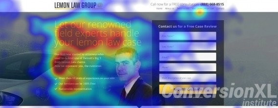
If an image of a person is used, but they’re looking away from the primary page element, it could tank your results. ConversionXL found that using no visual cue at all can still outperform one that uses a person looking away from the CTA.
You’d think simply changing that person’s eyeline to point at your Quote Request form or purchasing button would be the best option then, right?
Surprisingly, the visual cue that resulted in the longest ‘dwell time’ was a good old-fashioned hand-drawn arrow element.
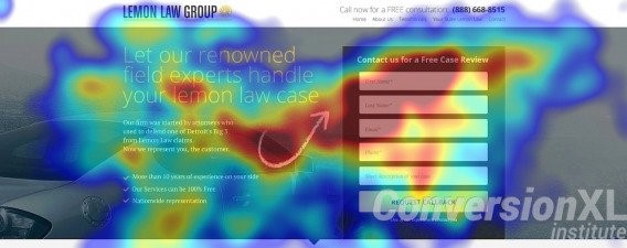
Besides arrows and lines, other visual cues like MASSIVE forms and triangle shapes also outperformed an image of someone looking directly at the form.
This doesn’t negate or disprove the power of faces in photos though. As we’ve already seen, stock photos or obviously fake images of people don’t help either (when compared with images of more realistic people).
It simply means if your goal is to direct visual attention on a page, try a hand-drawn shape or other page design change (as opposed to just slapping on a ‘decorative’ image of a person and expecting that to influence results).
Using images along with testimonials/social proof
A recurring theme here is that faces, when used in the proper context, can increase results significantly.
In an ideal world, your landing page photos or images should add value to the landing page’s experience – not be tacked on at the end just for aesthetics’ sake.
Unbounce has found that the use of real photos on testimonials can increase their impact (as opposed to ones with no photos at all).
And we’ve seen that the more realistic the photos, the better (as opposed to more polished, ‘professional’ looking ones). These act as a powerful form of social proof that builds trust and credibility.
ConverisonXL recently did another study to determine which types of social proof performed the best. Unsurprisingly, they found that again testimonials with real photos resulted in the highest recall of any social proof element that you can use.
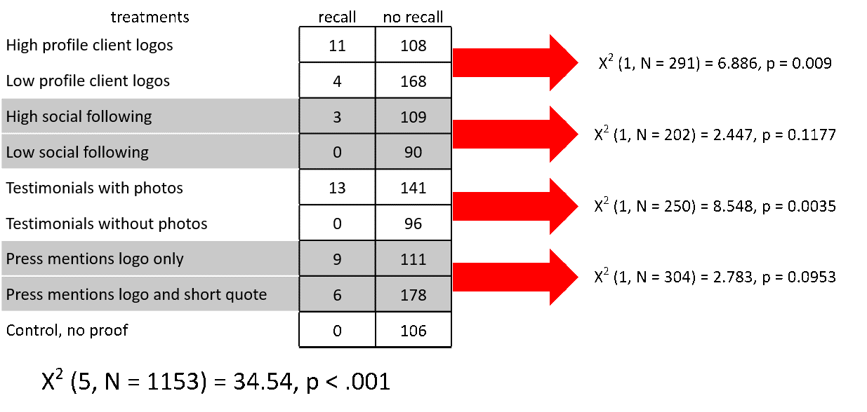
Coming in a close second however, were logos. “High-profile client” logos topped this category (as opposed to smaller, less well known clients), while “press mentions” followed closely behind in determining which resulted in the most recall.
Including bits and pieces of third-party validity can help add that extra credibility; making a memorable impact on potential viewers.
Connecting landing page images back to ads
A 1/10 Quality Score subjects you to a 400% CPC penalty.
That was one of the key findings in Larry’s great article on hacking AdWords, where your Quality Score plays a huge role in what you eventually pay for each click.
And Quality Score doesn’t just affect cost per click – higher QS also correlates with lower cost per conversion.
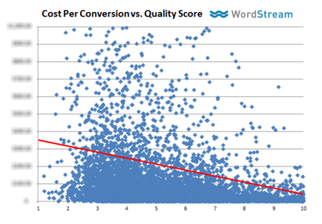
This double-digit ‘marginal cost’ for each increase or decrease in Quality Score was backed up by Jacob of Disruptive Advertising after analyzing their own 2,000 AdWords accounts over three years, totaling millions in ad spend (albeit 13% vs. 16%).
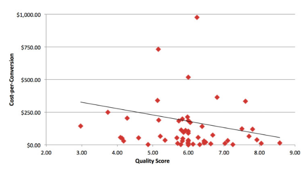
Great. Thanks. Why are we talking about this on an article about photos and images?
Because the photos and images used on your landing pages play a key role in message match, which affects your landing page Quality Score.
Message match involves strong tonal and visual alignment between all these elements:
- The search term someone uses.
- The advertisement they see.
- The landing page they hit after clicking.
Facebook has something similar (called a ‘Relevance Score’) which measures similar components and drives costs up or down accordingly.
The easiest way to screw up message match, which can cause high bounce/abandonment rates and low conversion rates, is by using conflicting or incompatible headlines, ad copy, and – you guessed it – images on your ads and landing pages.
This is also a surprisingly common mistake.
Oli from Unbounce clicked on over 300 paid ads (sorry advertisers!) and found that 98% of them didn’t match.
For example, here’s one of the few Facebook ad examples that, despite being kinda cartoony, at least got message match correct.
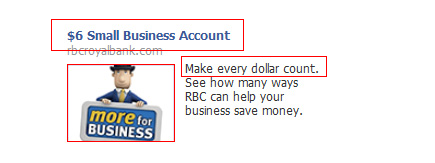
Notice the low-entry offer headline. The value prop in the description. And most importantly here, the little clip-art looking dude.
Here’s the landing page you would have seen after clicking on this ad:
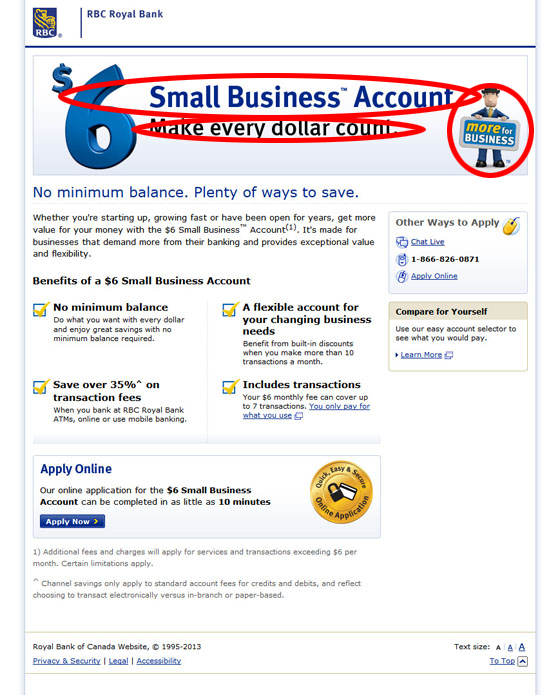
At the very top of the page, you see all three elements repeated, with our clip-art friend over to the right.
The key takeaway here?
When choosing landing page images, make sure they match as closely as possible to any images you use in the ad.
Using a person’s face, hand-drawn arrows, or all of the high-profile client and press logos in the world can’t save a landing page that doesn’t match the ad that sent people to it.
In Conclusion
When it comes to conversions, images really are worth a thousand words.
They communicate what’s on the page, why it’s beneficial, and what visitors are going to get out of it faster and easier than any block of text would.
Human nature means we’re naturally drawn to images featuring people’s faces (above almost all else). But only if they’re realistic and not stock or fake.
Beyond face-filled images, interactive and detailed product photos can increase attention and conversions, while social proof elements like client and press logos can also help boost recall.
But everything depends on context. Simply slapping on irrelevant images, no matter what they depict, doesn’t benefit conversions at all.
And when it comes to advertising, failing to align this image context on your landing pages with the initial ads and search terms people used can result in not only lowering results, but also forcing you to pay more at the same time.
