There’s no doubt about it — we are living in the digital age, and we aren’t going back. Truth be told, you’re living decades in the past if your business doesn’t have a solid online presence, particularly if you’re a retail-based brand.
Related: 6 Steps to Building a Million-Dollar Ecommerce Site in 60 Days
However, you likely do, and probably utilize those tried-and-true website design techniques — it should be responsive and optimized for mobile. It should be modern, have some negative space and organized intuitively. There’s some less-obvious care and consideration that goes into a website design, though, that could help you boost your online sales.
I looked at the three largest ecommerce retailers by sales according to eMarketer — Walmart, Apple and Amazon — to determine what it is they do that boosts their businesses into a league of their own, and what you can learn from them.
Walmart.com: The best mobile-optimized ecommerce website

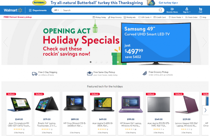
The supermarket behemoth that was once known for Midwestern storefronts and smiley-faced rollbacks has transitioned quite comfortably into an ecommerce destination for all. Beginning in 2014, Walmart.com started updating its website to boost its online presence, likely in a successful challenge to Amazon (more on that later).
Much like its softer, more modern logo redesign, Walmart.com’s new website is accented by a milder blue hue and plenty of negative space that allows each product to shine. However, the most important feature of Walmart’s ecommerce destination is its consistency on all platforms. Whether you’re shopping from your smartphone’s browser, your tablet of choice or a desktop computer, everything from search to checkout is easy, intuitive and dependable on every platform.
Related: Side Hustlers: Watch This Before You Launch Your Ecommerce Site
So, how do these small changes spell big payoff for Walmart’s bottom line? Well, first of all, that stellar mobile user experience reaps some positive reinforcement from Google, which has factored mobile friendliness into its rankings since 2015. Plus, the smartphone ecommerce features a prominent search bar and cart, and intuitive clicking throughout the screen, which makes shopping for steals even more of a breeze.
Walmart’s overall muscle behind its online shopping destination is paying off, too. In fact, Walmart recently copped to hosting higher prices online than it does in stores, proving that consumers really will pay a higher price for a greater convenience. And it’s working, too. Last year, the retailer’s online sales increased by 9 percent, resulting in a staggering $14.4 billion in sales. The bottom line? Ultimately, investing in mobile design will prove to be a big payoff.
What you can learn: A mobile-optimized website isn’t good enough. Instead, you should ensure your mobile destinations have the exact same experience as your desktop versions.
Apple.com: The best brand-oriented ecommerce website

If Apple is known for anything, it’s exceptional design and attention to detail. Lucky for us consumers, this care is extended to more than just iPhones and Apple Watches.
Apple’s streamlined design and sleek aesthetic is showcased throughout its minimalistic website, driving home its overarching brand ideals and solidifying consumer loyalty — something proven to drive bottom lines.
Related: How Clever Retargeting Persuades Customers Who Looked But Didn’t Buy
Need further proof that Apple invests in every detail of a user’s experience? Take a look at its human interface guidelines. While that may deal with designing its products, it ultimately reflects the qualities portrayed in Apple’s online store. After all, you can’t sell a product online without a digital destination, so you might as well make sure they match.
Apple’s interface designs place high emphasis on a consistent look and feel brand-wide, clean grids and placing users in control of their overall experience — all of which is demonstrated in its website. The products are displayed in grids, and interactive demo videos and infographics throughout the website allow the users to compare, contrast and — yes, you guessed it — control the entire shopping experience.
And Apple’s brand consistency, from products to an ecommerce website, pays off in a big way. Brand allegiance and a smooth experience lower bounce rates, which ultimately boost sales.
What you can learn: Put that brand book to use, and employ the same design guidelines in your website as you do each product to drive home a strong user experience and increase brand loyalty.
Amazon.com: The best product-driven ecommerce website

Truth be told, Amazon doesn’t have the best website design on the internet.
Hear me out, though.
The homepage is cluttered, product pages are laden with ads and — combined with the grocery and video options — the overall website can be a bit distracting for consumers who visit the website with a particular purchase in mind. However, Amazon provides great deals, exceptional checkout and delivery, and places nearly every product you could ever need at your fingertips, rendering it almost irreplaceable.
According to Shopify, this clear purpose is paramount to successful ecommerce sites. Amazon’s in-depth reviews, complete product descriptions, and extensive confirmation emails show us that, ultimately, people want an online store that will get them what they need, stat. Amazon.com fulfills that need tenfold, as demonstrated by its third quarter sales, which jumped up 34 percent to $43.7 billion.
What you can learn: At the end of the day, if you sell high-value products, the customers will come.
In ecommerce website design, it’s important to remember that people are looking to acquire a product as easily as possible; at the end of the day, every design decision should capitalize on that end goal. Whether that’s through a simple smartphone purchase, consistent branding, products that are the best bang for their buck or something totally different, find the qualities your demographic values most and execute them on your website. Combined with a simple design and easy UX, your online store’s profits are sure to amaze.
What are your favorite ecommerce websites?
Related Video: How to Create an Online Business in Your Spare Time
