Much like with Facebook, the team at Instagram regularly tweaks the ad experience in a bid to improve advertiser results over time. You’ve probably already seen one of the most recent examples of this, with Instagram rolling out a major change to ad calls to action (CTAs) on the platform back in mid-June.
After conducting a two-month-long study on the change as part of my work at Nanigans, we observed gaming advertisers seeing noteworthy improvements in terms of cost per install, click-to-download conversion rates, and click-through rates.

But that change is just the tip of the iceberg. Instagram is in the midst of testing other ad unit alterations that, if implemented widely, would necessitate a shift in how marketers both measure and strategize around their ad activity.
Unpacking the full-width CTA change
The new CTA format mentioned above replaced an earlier two-step overlay click experience and shifted the CTA text (like “Shop Now” or “Install Now”) to the left-hand side — an area closer to the familiar “Like” and “Comment” buttons.
The intent was to put that text closer to the buttons Instagram users regularly look for — presumably better streamlining the act of conversion, which the study results reasonably support.

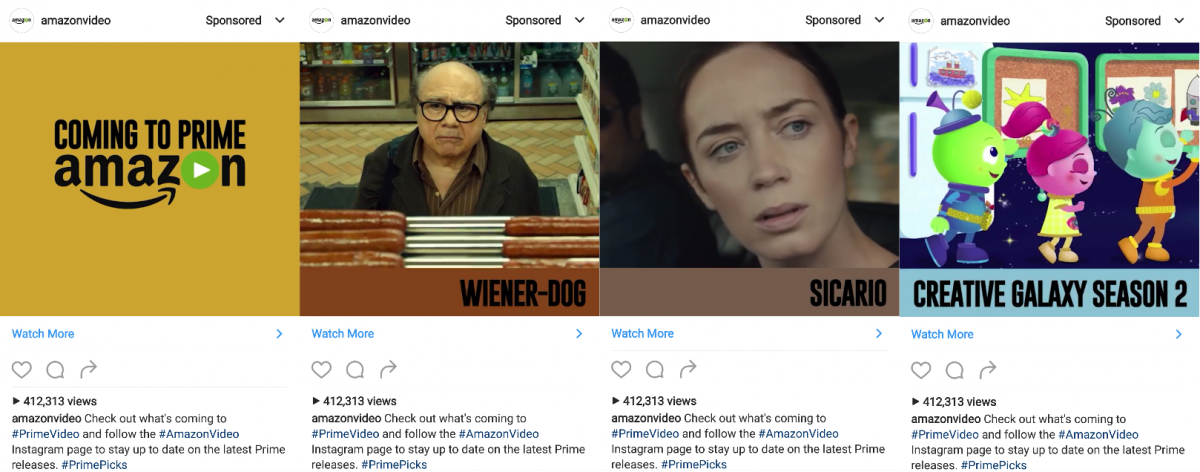
On top of the improved metrics, advertisers should see the new CTA as an opportunity to engage better with target customers through creative choices that play off this change. An example below highlights titles as bars just above the CTA, better drawing users’ eyes towards the “Watch More” callout.

The renewed need for ‘sticky’ ads
A few months after the rollout of the full-width CTA, Instagram iterated once again, making the CTA automatically highlight after a few seconds. After some initial testing with iOS audiences, this change is now part of all users’ Instagram feeds.
This is just one of several changes Instagram is either testing or rolling out that emphasize the importance of capturing users’ attention with your ad.
Already widespread is the presence of a separate CTA within the comments section for every ad, giving users yet another chance to engage. Meanwhile, Instagram is also testing functionality for video ads that, when actively unmuted by the user, display the destination URL in a split screen with the video still playing.

In aggregate, Instagram simply gives you more chances to convert the user if you deploy creative that retains their attention. Best practices in this realm are going to vary based on company target audience and campaign goal, but in general, unique visual elements that spur a “second glance,” or simply calling out a limited-time promotion, are solid starting points.
You can find some other examples of engaging Instagram ads here.
Other oncoming changes you need to plan for
Other tests Instagram is currently running point to further changes in how you should view related campaign metrics, along with emphasizing a more holistic message to users.
On the first point, the aforementioned test surrounding unmuted video ads comes paired with a less flashy but fairly significant back-end change. Each video ad that gets unmuted as part of the test is cataloged as a link click by Instagram, meaning that “video unmutes” are reported the same way as direct CTA clicks.
As the user does view the destination URL in the ensuing split screen, this is an understandable change from Instagram’s end, but it’s worth keeping in mind when you’re comparing historical performance of video ads, particularly if this test rolls out more widely in the coming months.
A more front-end test relates to Instagram pulling external information into the CTA itself, including item price, destination URL or app store rating. While presently only pulling in the destination URL for ads pointing to web addresses, as the test expands and possibly rolls out widely, marketers will need to be keenly aware of these external data sources and how they may appear to targeted users on Instagram.
Start asking yourself now — are app store ratings where you want them to be? Are pixels implemented properly to feed data to Facebook and close the loop on new pricing promotions or changes, reflecting what’s displayed on your site?
Of course, these latest tests are just that, and still may not end up seeing widespread deployment. However, they undoubtedly indicate the direction Instagram is moving in terms of more advanced functionality and giving users more information within the ad unit itself. Marketers need to plan for these changes now so they don’t get set back on their heels later.
Some opinions expressed in this article may be those of a guest author and not necessarily Marketing Land. Staff authors are listed here.


